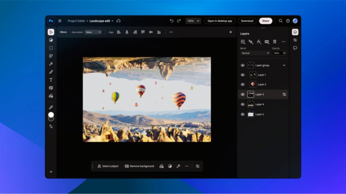
Adobe has just unveiled Spectrum 2, the latest iteration of their renowned design system, marking a significant leap in the evolution of their app and web interfaces. Spectrum, Adobe’s foundational design framework for the past decade, has undergone a transformation with Spectrum 2, introducing a more vibrant and user-friendly experience. This update aligns with Adobe’s commitment to making creative tools more intuitive and accessible, emphasizing their mantra of “Creativity for All.” The fresh elements of Spectrum 2 are already enhancing Adobe’s web applications, such as the Firefly generative AI service, Adobe Express, and the new Adobe Acrobat web experiences.
Spectrum 2 is built around three key design principles: dynamic contrast and brightness, accessible color schemes, and a refined attention hierarchy. These improvements aim to prioritize essential visual elements, making the user experience more engaging and inclusive.
I recently had the opportunity to speak with Eric Snowden, Adobe’s VP of Design, about the motivations driving this update. Snowden highlighted the significant shift in Adobe’s audience over the last decade. “Adobe is reaching broader demographics now, including students, social content creators, and small business owners. This diversity demands a design that’s not only compliant with accessibility standards like color blindness and WCAG but also approachable for newcomers,” he explained.
Adobe’s expansion into various platforms, including virtual reality tools, reflects this inclusive approach. Unlike the original Spectrum, which catered primarily to professional users, Spectrum 2 aims to bridge the gap between professional creatives and other user segments.
The original Spectrum design was characterized by a minimalistic, serious aesthetic. However, Snowden noted a shift in focus: “We’re a creative company and want our design to reflect approachability, brightness, and fun. It’s about finding a balance between letting creatives’ work shine and providing an inspiring, user-friendly interface.”
The rollout of Spectrum 2 will commence with updates to Adobe’s web and iOS applications in early 2024, eventually encompassing over 100 apps, including flagship desktop tools like Photoshop, Lightroom, and Premiere Pro. Implementing a new design system across such a broad suite of applications is a colossal task, but Adobe is confident about the gradual implementation throughout 2024.
Snowden emphasized the importance of maintaining flexibility for professional users while enhancing the initial experience for new users. “Our goal is to advance creativity while respecting the workflows of our seasoned users. We’re committed to modernizing our tools, making them more intuitive and efficient,” he said.
Additionally, the introduction of Spectrum 2 offers Adobe’s product teams a chance to showcase newer features that may have been overlooked in previous designs. This update not only refreshes the look and feel of Adobe’s suite but also highlights modern functionalities that enhance user creativity.
In conclusion, Adobe’s Spectrum 2 represents a significant step forward in design system evolution. Its focus on dynamic contrast, accessibility, and user-centric design elements positions Adobe as a leader in creative software innovation. The rollout of Spectrum 2 promises to enrich the user experience across Adobe’s extensive suite of applications, fostering a more inclusive and intuitive creative environment.


